


Whose Data is it, Anyway?

At the corner of Greenwich and Fulton in New York City, 2,983 names are arranged around two square reflecting pools, the footprints of the World Trade Center. Permanently etched in bronze parapets, the names are a public list of those lost in the 1993 and 2001 attacks.
But it is more than a list. As well as preserving their names, the memorial also preserves their relationships. Visual data artist Jer Thorp worked with designers to produce an algorithm and a software tool that would arrange the names according to nearly 1,500 “meaningful adjacency” requests made by next‑of‑kin.
Family sits with family. Friend next to friend. Officemates, flight crews, first responders – memorialized not just for who they were, but for what they meant to each other. We think of social networks as something fluid and constantly changing, with much of the machinery whirring behind the scenes. But the 9/11 memorial is a static network, a freeze‑frame of relationships at a single moment in history.
Though this is one of his best known and most personally affecting creations, Thorp had already been working for years as a data artist, creating visual representations of massive and complex data sets and organizing the information to give it the context of a narrative. His projects ranged from tracking the sharing activity of New York Times readers over social media to representing each and every person in the UK’s National DNA Database – 4.5 million in all – in a single graphic organized by race, age, and criminal record.
“By placing data into a human context, it gains meaning,” Thorp told a TEDxVancouver crowd in 2009. “Because it automatically builds empathy for people involved in these systems, and that turns into a fundamental respect.”
But within a few years of the memorial project, he gradually came to challenge his own medium, worried about the false sense of objectivity the data engendered and the increasing impact that the owners of that data had on our daily lives.
“I think in the beginning it was easy to take a data set that you downloaded from the web and do some clever things with it without being critical about where that data came from, who recorded it, and why, and what are the politics of the data,” he says. “Visualization was the way that I got into the subject of data, but since then I’ve been pretty skeptical about it. Most of the work that I’ve done for the last four or five years has been thinking about other methods that can be used to both communicate data and to find agency with data.”
Now a proponent of “data humanism,” Thorp speaks out against the monopoly and misuse of our data, empowering users to reclaim the agency of their own information.
Born in Edmonton, Thorp grew up in Tsawwassen, BC, entering UBC in 1993 to study cell biology and genetics. But like many tech entrepreneurs on the edge of the Silicon Valley boom, he found his pursuits outside the classroom more rewarding. He left the school in his last term, working for a few years at the Vancouver Aquarium before eventually pursuing a freelance career developing websites and experimenting with visual tools that would help him understand complex systems.
“I went from a web developer who would do weird internet art on the side to being a weird internet artist that would do web development on the side,” he says.

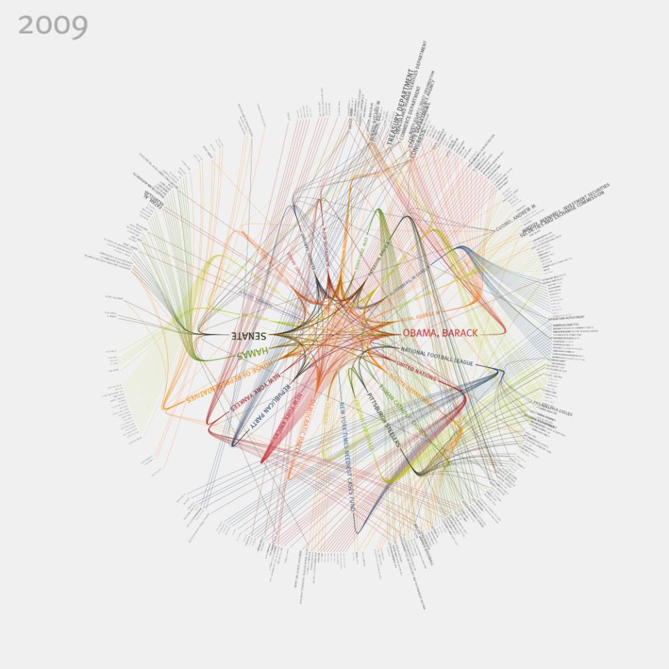
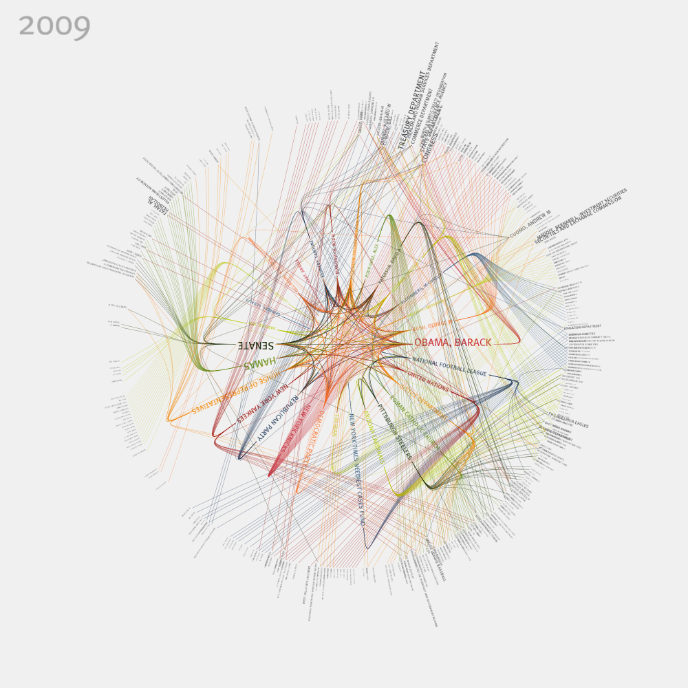
It was a slow transformation. Though his early work was focused on the aesthetics of visualized systems, he soon started noticing how these systems had political and social questions baked into them. A series of projects based on New York Times content, for example, examined the inverse ratio between mentions of “communism” and “terrorism” over a nearly 30 year period; the frequency of the words “hope” and “crisis” over the same period; and the intricate connections between people and organizations mentioned in a year’s worth of content, represented in a single graphic.
As the reach of social media grew, taking an increasingly central role in data collection, Twitter and Facebook gave him an even greater palette to draw from. In 2009, he collected tweets that included the words “just landed” to plot the travel patterns of social media users. Soon after, he created a 3D model of people around the world tweeting “Good Morning,” colour‑coded to reflect what time they got up.
Essentially, he was collecting our stories – taking discrete bits of information and building them into structures to form individual and collective histories. Some of these projects were for clients, others in collaboration with his partners at the (now closed) Office for Creative Research, and some just for fun, an exploration of this new frontier of collected personal data.
“This idea of using narrative to frame our way through a complex data set is something that we’ve done over and over and over again,” he said in a recent fellowship speech at the Library of Congress. “Because I think it does give us a chance to investigate the things that are otherwise really difficult to investigate. So I believe that if aliens were to touch down today and try to understand our culture, they would look towards these gigantic data sets.”
“I believe that if aliens were to touch down today and try to understand our culture, they would look towards these gigantic data sets.”
But the more Thorp immersed himself in the stories behind the data, the more wary he became of its objectivity. He began looking at how the data was manifested in the first place, the conditions that led to its creation, how to be critical about what is missing as much as what is shown, “to try to throw a wrench into this belief the data can be objective.”
“In my own work, I’ve been really aware of how am I reinforcing the messages that come from Silicon Valley and the powers that be, the narratives of what we can and can’t do with data,” he says. “We need to be thinking about different mechanisms. So for me that’s meant building projects that are more participatory, that don’t depend on technology as much.”
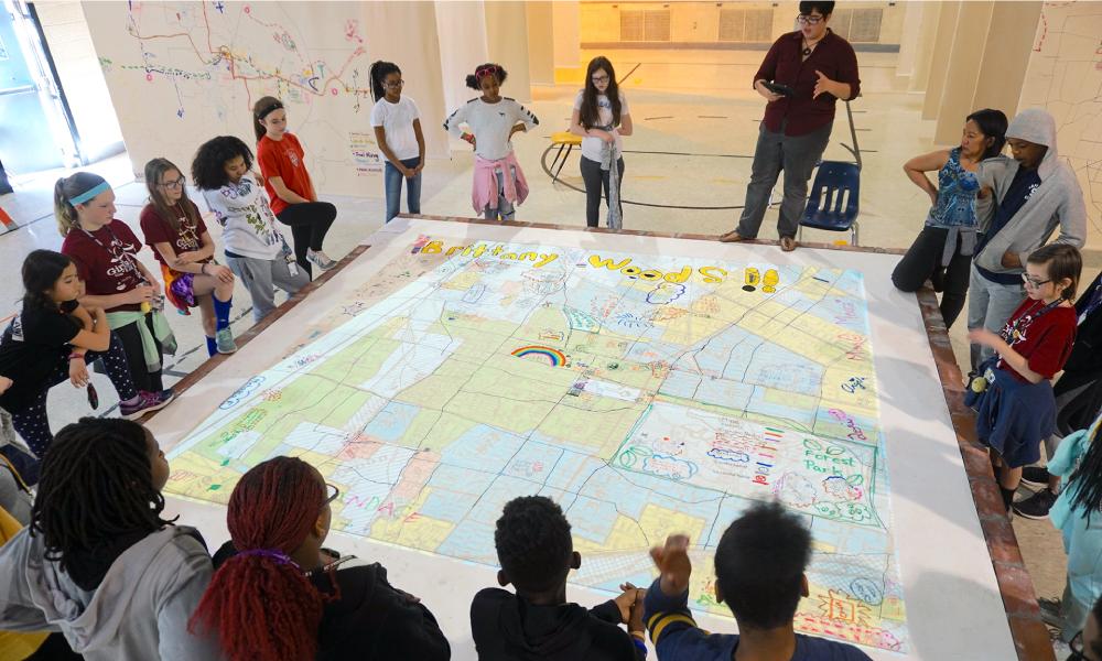
Among his most impactful projects was one he credits for fueling his transformation from data artist to data humanist: the St. Louis Map Room, a 2017 collaborative mapping experience that took him a decade to realize.
Over the course of a month, 29 different groups occupied a vacant school gymnasium to hand‑draw 100‑square‑foot maps of their neighbourhoods from their perspectives as residents. Community organizations drew data they had collected by hand – bike traffic, gardens, churches, food banks. Students drew their routes to school, noting which were safe and which were dangerous.
Each group then got to see official city data projected onto their map, from bus lines to poverty statistics, confirming or challenging discrepancies between civic data and lived experience. For the first time, locals could see how they were represented, and misrepresented, in the official numbers.
“If mapping is a source of power,” Thorp wrote of the project, “each mapper claimed some of it by making maps of their community that reflected them as they are, or that communicated what they’d like them to be.”
While Thorp admits that part of this new phase of his work was to provoke, his real interest was in providing people with experiences that give them a sense of agency. All cities have some form of portal that allows citizens to see their collective data, but most residents can’t access or organize this information in any meaningful way.
“What the Map Room does is it gives people a mechanism in which they can feel like they have a way not only to find value from that data so they can understand things about their city that they maybe didn’t understand before,” he says, “but that they can find ways to critique that data, and to come back to the city and say that they feel like the story that is wrapped around their lived experience is not being accurately represented in that data.”
With plans to expand to other cities over the coming years, the Map Room project is one of a growing number of tools opening the door for the disenfranchised to access and understand their community data and how it is being used.
But Thorp is out to slay an even larger beast. As much as social media has provided a boon of raw data to study and make art out of our public lives, it has also fuelled the growth of surveillance capitalism – the practice of Big Data using our information to classify us, predict our habits, and sell us products.
As much as social media has provided a boon of raw data to study and make art out of our public lives, it has also fuelled the growth of surveillance capitalism – the practice of Big Data using our information to classify us, predict our habits, and sell us products.
Data humanism is partly a response to this threat – designing data systems for the well‑being of the people from whom it was taken and providing them with mechanisms for feedback. Thorp and other data humanists believe we should do more to honour the complexity of individual and community realities, so we can create real, functioning data publics.
“What is it like to live in data?” Thorp asked in his Library of Congress address. “It sucks. I don’t mean that only in the pejorative, I also mean that it’s like a gigantic vacuum cleaner. We are the subject of extraction...The word collection or the word gathering are these neat and polite ways to describe something that I think is a little more violent. We’re scraping and abstracting and mining data from individuals.”
In other words, our social habits, dutifully recorded on our devices and sold to third‑party vendors, are being tracked and monetized. We are being used by advertisers – most of the machinery surrounding our data exists to place ads in our web browsers.
But it’s not the collection of information that’s having a chilling effect on our democracy. From this data, advertisers build tightly focused demographic profiles and make decisions that have a direct impact on our lives – the level to which we can be insured, the type of health insurance we’re being presented with, the credit cards we’re being offered.
Thorp believes we can change this practice, that we can return data agency to the first party: Us. In 2015 he co‑founded Floodwatch, a Chrome browser extension that tracks the ads a user sees on the internet and helps them understand how their information is being used to build their online identities. The information is also sent to researchers, who can use the data to track discriminatory advertising practices – something easy to spot in traditional marketing venues, but much harder to see online where ads are targeted towards individual users.

Thorp had previously helped design Openpaths, a secure data locker for smartphones that takes the location data a phone generates and translates it into useable information for the owner, such as understanding what resources go into their transportation choices or optimizing their data plans based on where and how often they travel.
Like Floodwatch, Openpaths gave users the option of donating their data to researchers, who could repurpose it for the public good in areas such as epidemiology, disaster response, and urban planning. But at its most basic, Openpaths was about empowering the user to form a relationship with their data in a way that made sense to them.
“Data visualization as a medium is something that’s sort of born out of the hard sciences, and as a result I think the ways that we typically try to visually communicate data are exclusionary,” says Thorp. “They don’t speak to a ton of people, so the work that I’ve been invested in the last part of my career has really been about trying to bring data into public space, trying to get the language that we use to communicate data out of charts and graphs, into some types of communication that are maybe friendly and a little bit different than what we expect from visualization.”
His work has not gone unnoticed. In addition to his recently completed residency at the Library of Congress, Thorp has spoken at venues ranging from New York’s Museum of Modern Art to NASA’s Jet Propulsion Laboratory, and his work has been seen in publications as varied as Scientific American, the New Yorker, WIRED, and the Harvard Business Review. He has been recognized as a National Geographic Explorer and a Rockefeller Fellow, and in 2015 was named by Canadian Geographic as one of Canada’s Greatest Explorers.
Currently an adjunct professor at NYU, Thorp is publishing his first book next year – Living in Data – detailing how we got where we are with data, the work he and other disrupters are doing around surveillance capitalism, and a road map about how we might achieve something better.
“I think it’s important to understand that we’ve gotten to where we’ve gotten to very quickly,” he says. “So any idea that we might have that this path we’re on has any kind of permanence I think is a myth that certain parties would like us to believe. I do think we still have some power to plot out what our future might look like.”


